Data analytics
DATA ANALYTICS PORTFOLIO

Turning Complex Data
Into Actionable Insights

As a Data Analyst, I bridge the gap between raw data and executive decisions. Using SQL to extract data, Python, Excel, and Power Query to clean and transform it, and Power BI/Tableau to build interactive dashboards, I create automated solutions that drive growth.

0+
Projects
0
Rows Analyzed
0+
Years Exp.
0%
Satisfaction

Faith Seita Portrait
Portfolio

Featured Projects

A selection of data analytics and machine learning projects that demonstrate my ability to clean, analyze, model, and visualize complex datasets.

Raw Messy Data
Python Code for Cleaning
Cleaned Data
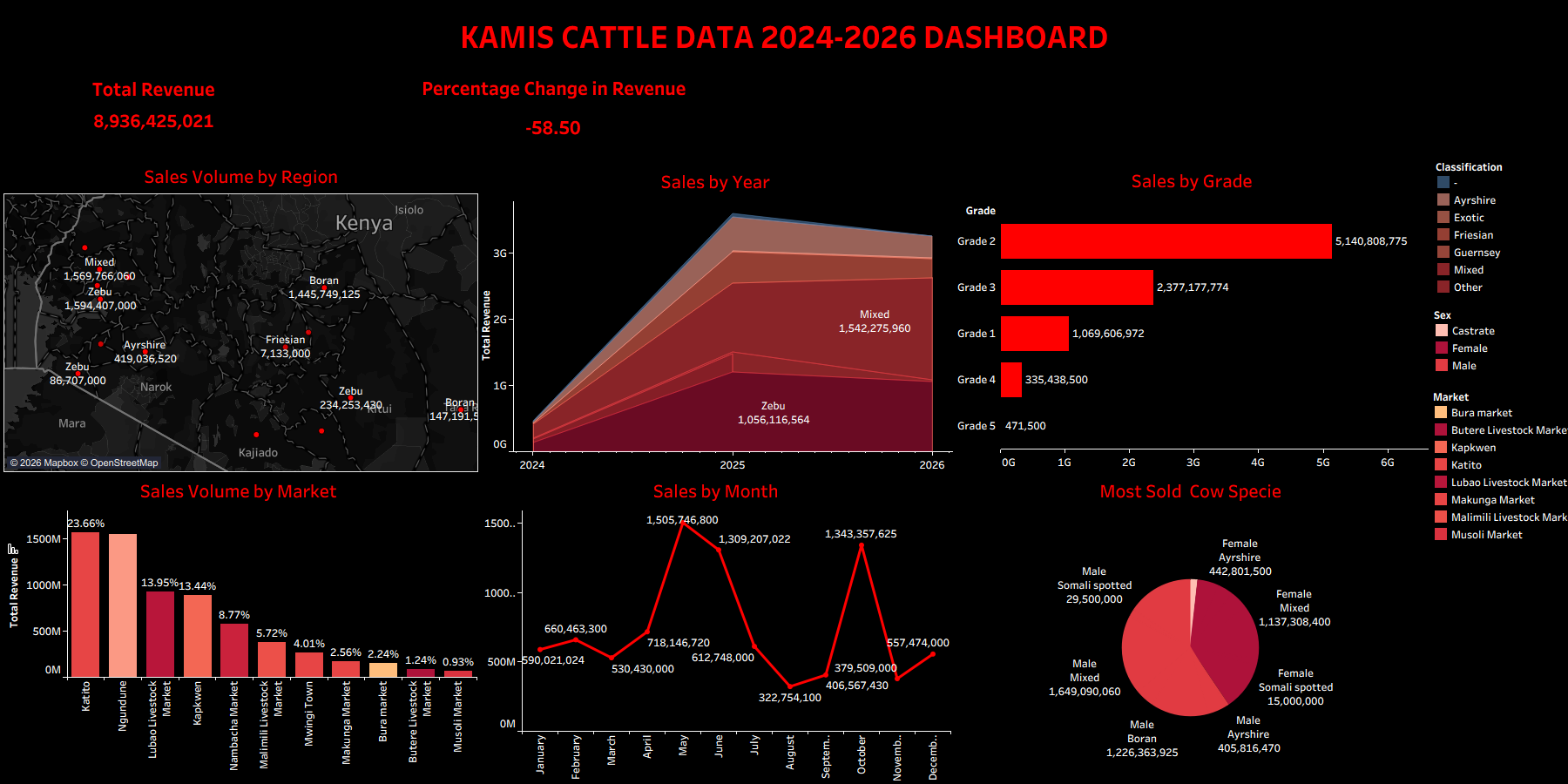
Kamis Cattle Dashboard Kamis Cattle Dashboard
Python Data Cleaning Tableau Excel

Cattle Market Sales Analysis & Revenue Optimization

Overview: Analysis of livestock sales data (2024–2026) to identify revenue drivers, market performance, and optimization strategies.

  • Problem: The raw dataset was highly unorganized — missing numeric fields, dates out of chronological order, and no month/day metadata — preventing accurate seasonal analysis.
  • Solution: Combined Excel for initial profiling with Python for datetime standardization, missing value imputation, and feature engineering. Built an interactive Tableau dashboard to visualize revenue, breed performance, and regional sales metrics.
  • Impact: Identified May as the peak revenue month, male Zebu and mixed breeds as top performers, Katito Market as the highest revenue driver, and Grade 2 as the highest volume grade. Recommended that low‑revenue months like August concentrate sales on Katito Market and these high‑demand breeds to lift revenue.
Clean Finance Data
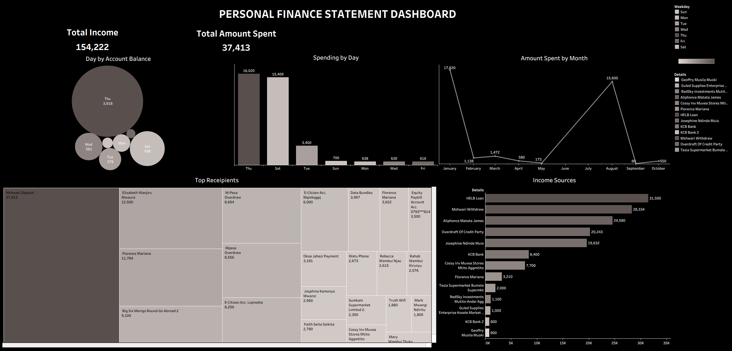
Personal Finance Dashboard Finance Dashboard
Data Viz Excel Power Query Tableau

Personal Finance Analysis & Budget Optimization

Overview: Developed a dynamic personal financial tracker to analyze income sources, daily expenditures, and monthly spending trends to drive better savings habits.

  • Problem: The user struggled with poor spending habits and lacked a reliable tracking system, making it impossible to audit cash flow, identify waste, or understand true spending behavior.
  • Solution: Utilized Excel Power Query to ingest, clean, and structure raw financial transactions. Engineered data models to track day‑of‑week and monthly patterns, then built an interactive Tableau dashboard for continuous financial monitoring.
  • Impact: Pinpointed a major spending anomaly on Thursdays (averaging 16,020 annually), identified August as the peak spending month, and validated strong baseline savings of 37,413. Provided strategic advice to enforce strict budget limits on Thursdays and during August to preserve cash.
Financial Management System Demo
Full‑Stack Python Flask AI Chat Dashboard

Seita Financial Management System

Overview: A full‑stack personal finance dashboard that ingests M‑Pesa statements, categorizes transactions, and provides AI‑powered spending insights.

  • Problem: Raw M‑Pesa statements are difficult to interpret; users have no way to track spending patterns, identify wasteful habits, or generate actionable budgets.
  • Solution: Built a Flask web application with an interactive dashboard that automatically parses uploaded statements, computes monthly overviews, spending breakdowns, income sources, and weekday trends. Integrated an AI chat assistant that answers financial questions using the same data.
  • Impact: Delivered instant visibility into spending habits: flagged Friday as the highest‑spending day, September as the peak spending month, and validated a savings rate of 28,545 KES. The AI assistant provides on‑demand recommendations, helping users enforce tighter budgets and improve financial health.
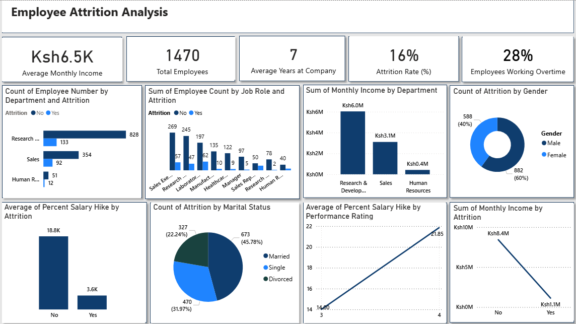
Employee Attrition Dashboard
HR Analytics Excel Power BI Dashboard

Employee Attrition Analysis & Retention Strategy

Overview: A data‑driven investigation into the key drivers of employee turnover using a public HR dataset, with the goal of helping HR teams transition from reactive to proactive retention strategies.

  • Problem: Rising employee attrition was increasing recruitment costs and reducing productivity. The HR department lacked a clear picture of which departments, demographics, and income brackets were most affected, making it impossible to design targeted interventions.
  • Solution: Cleaned and standardized a Kaggle HR dataset in Excel, then built an interactive Power BI dashboard with KPIs, department‑wise attrition visuals, and income‑vs‑satisfaction analysis. The dashboard visualised total employees, attrition rate, average tenure, overtime percentage, and average monthly income.
  • Impact: Identified Sales and R&D as the highest‑attrition departments, revealed that low income and job satisfaction were strong turnover predictors, and found that married employees and males exhibited higher attrition rates. Recommended salary restructuring, targeted retention programmes, and continuous KPI monitoring to cut attrition and save costs.
Skills & Expertise

Technical Skills

01

Python

Powered by Pandas and NumPy for advanced data manipulation, and Matplotlib for exploratory visualization.

02

Excel & Power Query

Leveraging Excel and Power Query for seamless data cleaning, modeling, and workflow automation.

03

Power BI/Tableau Dashboards

Interactive sales dashboards with DAX measures, real-time data, and actionable KPIs.

04

SQL & Data Modeling

Complex queries, data extraction, and preparation for analysis and reporting.

Tech Stack

Tools & Technologies

01

Python Ecosystem

Pandas, NumPy, Matplotlib, Scikit-learn, and XGBoost for end-to-end data analysis pipelines.

02

BI & Visualization

Power BI, DAX, interactive reports, and real-time dashboards that turn raw data into business decisions.

03

Time Series & Forecasting

Seasonal decomposition, moving averages, ARIMA, and ML forecasting for revenue trends.

Let's Work Together

Data-Driven. Impact-Focused.

I help agricultural and financial enterprises turn messy data into clear, actionable insights that increase revenue and efficiency.